Life After Life

Family Collaborator
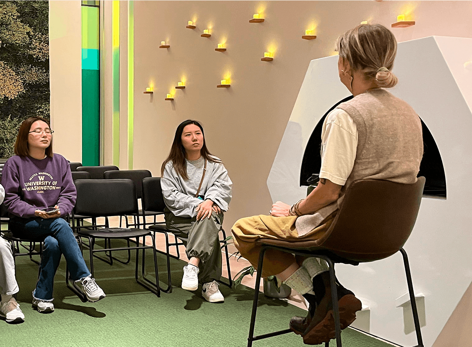
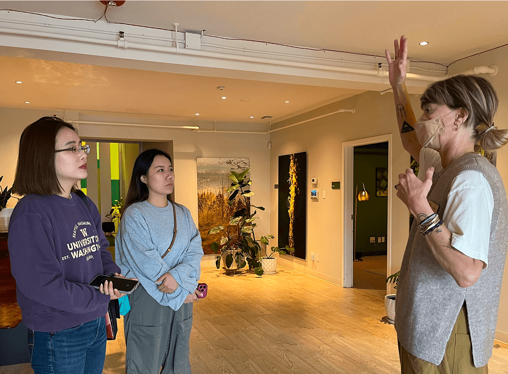
Before we jumped into design, we knew we had to slow down, and listen. We conducted extensive user research using 3 different research methods: user interviews, surveys, and guided tours.
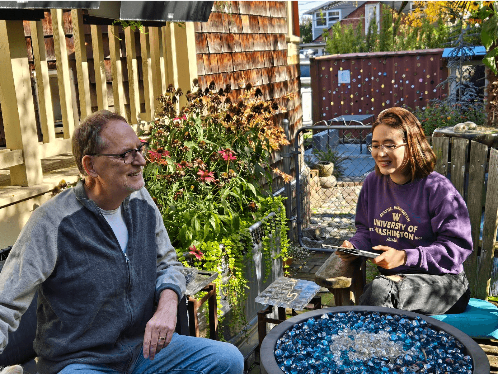

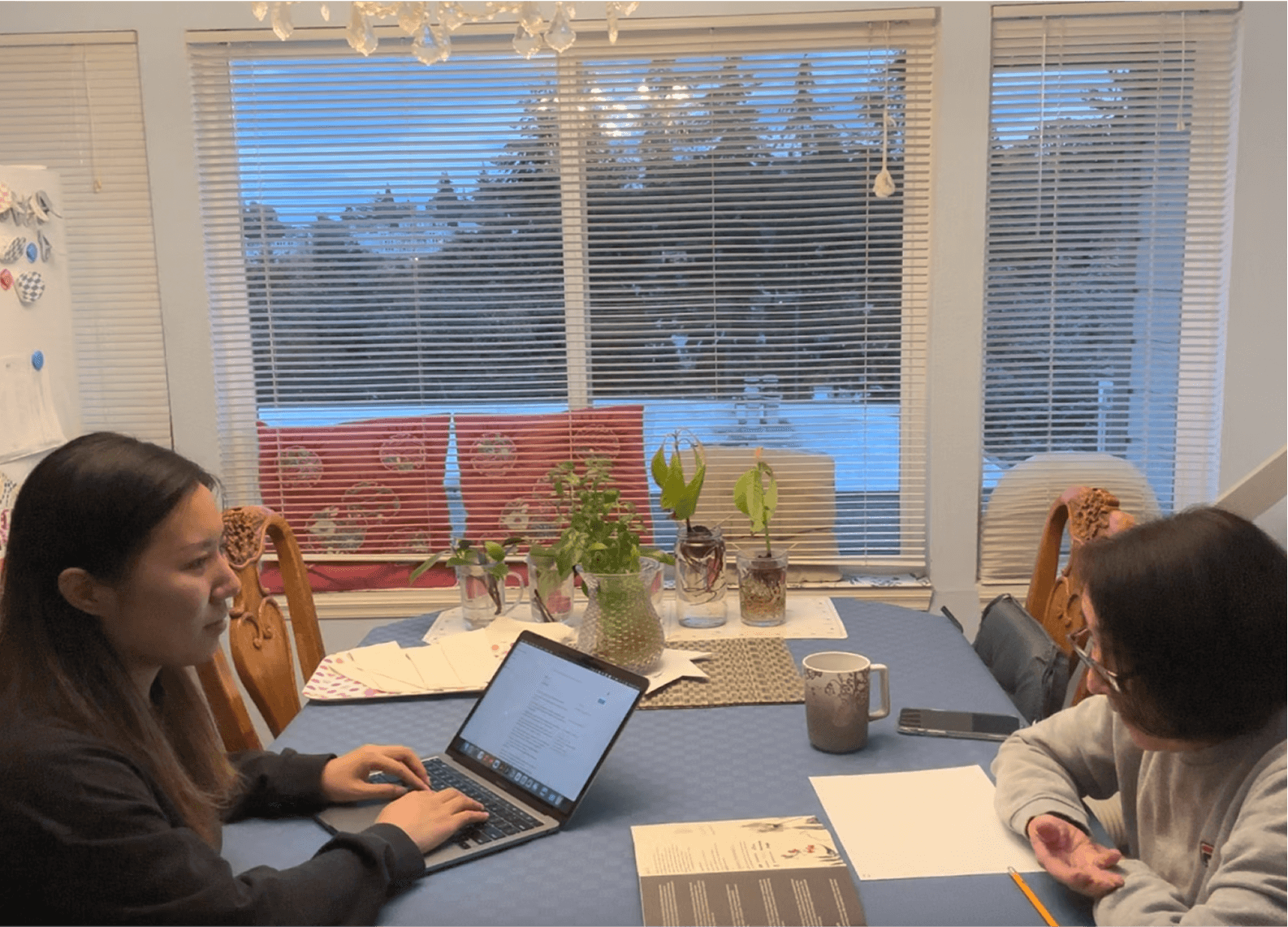
Death is a deeply personal, emotional, and often avoided topic. So our research wasn’t just about identifying problems, it was about understanding the emotions, cultural nuances, and unspoken tensions that surround end-of-life planning.

☹︎ 1
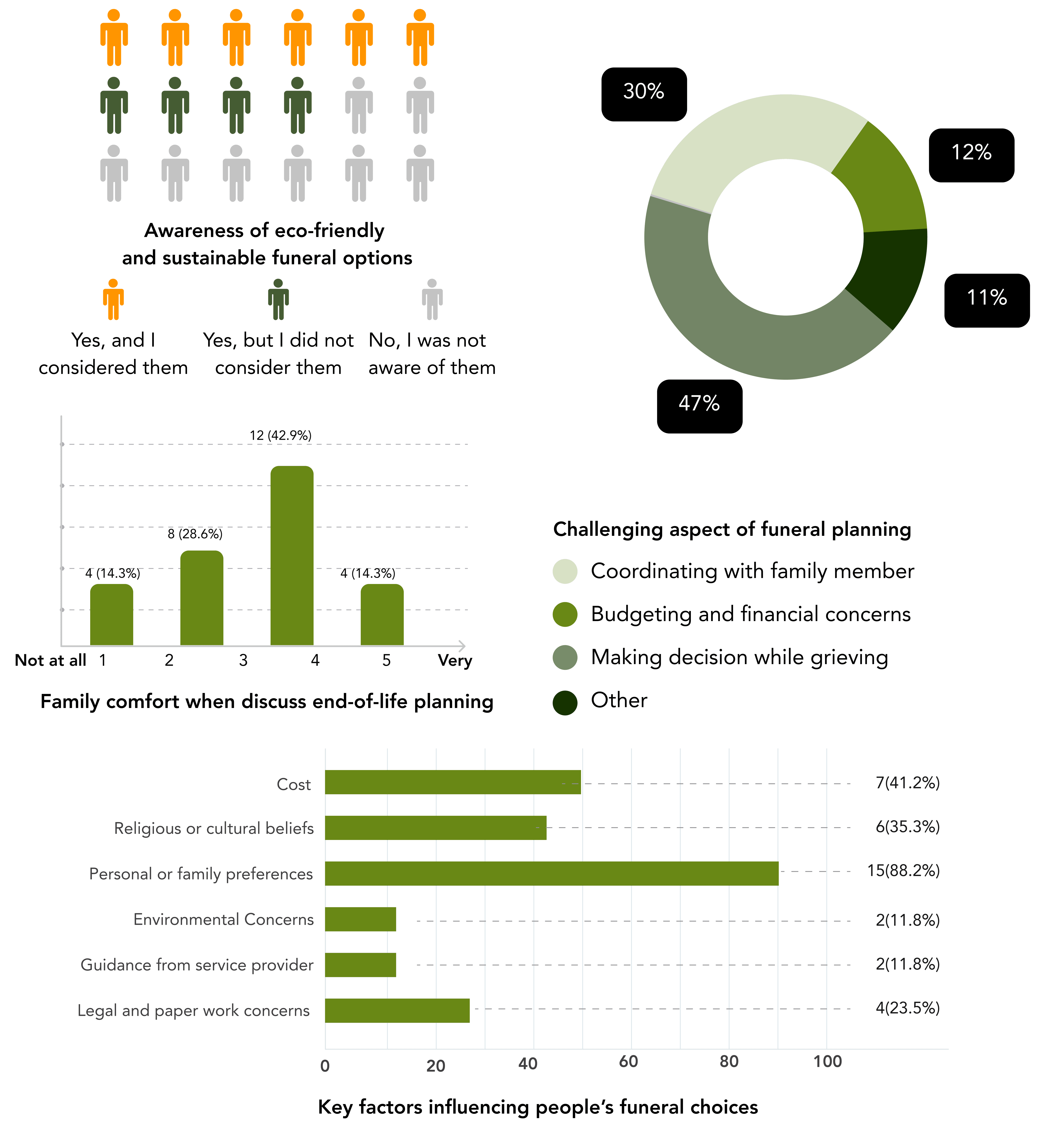
People wanted to make end-of-life decisions that reflected their values, but felt lost in logistics, paperwork, and unfamiliar terminology.
☹︎ 2
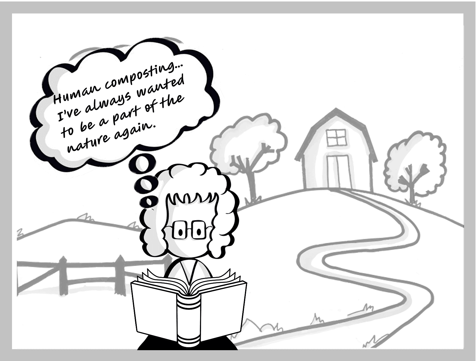
Sustainable alternatives like tree burials or human composting were rarely known or accessible.
☹︎ 3
People often avoided discussing death with loved ones, even when they wanted to out of fear of discomfort or cultural taboos.
After listening to people talk about their experiences with loss and funeral planning, one thing became clear:
Most people didn’t know where to start, and when they tried, it felt either too emotional, too overwhelming, or too cold.
We wanted to explore ways to make end-of-life planning feel more like a reflection of who someone is, not just a checklist of logistics.
At first, we imagined Life After Life as a simple digital tool you could use on your phone. But after really listening to the people we were designing for, we discovered something important:
For people in their 60s–80s, something they can hold and flip through just feels easier.
A physical product lets families sit down, share, and reflect together at their own pace.
Planning takes time; physical products allow thoughtful conversations before decisions.
Because of that, our design process highlighted the need for a multi-layered approach and a toolkit you can hold, share, and grow with: a card deck, a planning book, and one day, a journey to the forest. Each piece serves a different role:
DISCOVER
The forest offers a space to reconnect with nature and legacy
The card deck sparks meaningful conversation with loved one


🚌 DISCOVERY
The bus tour to the forest, designed for elders, families, and care homes to visit a place where death and life meet.
In this Memorial National Forest, donated soil from human composting nourishes trees and native landscapes.
Visitors walk through winding paths, and learn more about sustainable funeral alternatives.

Inside the Visitor Center, visitor can explore:
Interactive exhibits on green burial methods
A welcoming Death Café, where death doulas host open, gentle conversations
A holographic forest map, where families can locate trees nurtured by their loved one’s soil
A Memory Room to view photos, messages, or videos on anniversaries
2. 🎴 ENGAGE
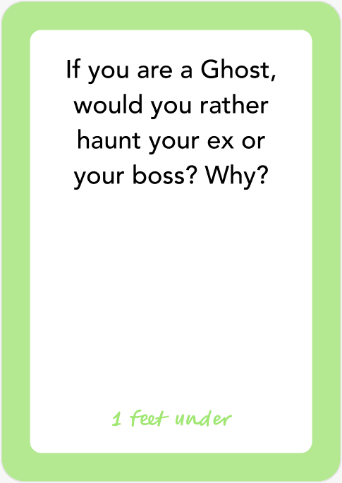
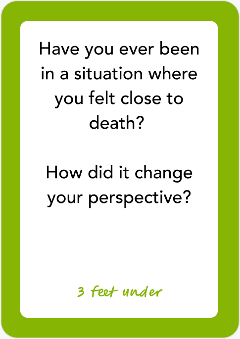
During the visit, visitor are introduced to the card deck, which offers a gentle way to open up about the topic with loved ones. Designed for families and care homes, the deck moves through three tiers of depth:


3. 📘 Learn
(Chapter 1 of the Guidebook)
Invites readers to explore sustainable funeral options through playfully, thought-provoking questions.
We turned facts into a pop-quiz-style experience that surprises and informs:
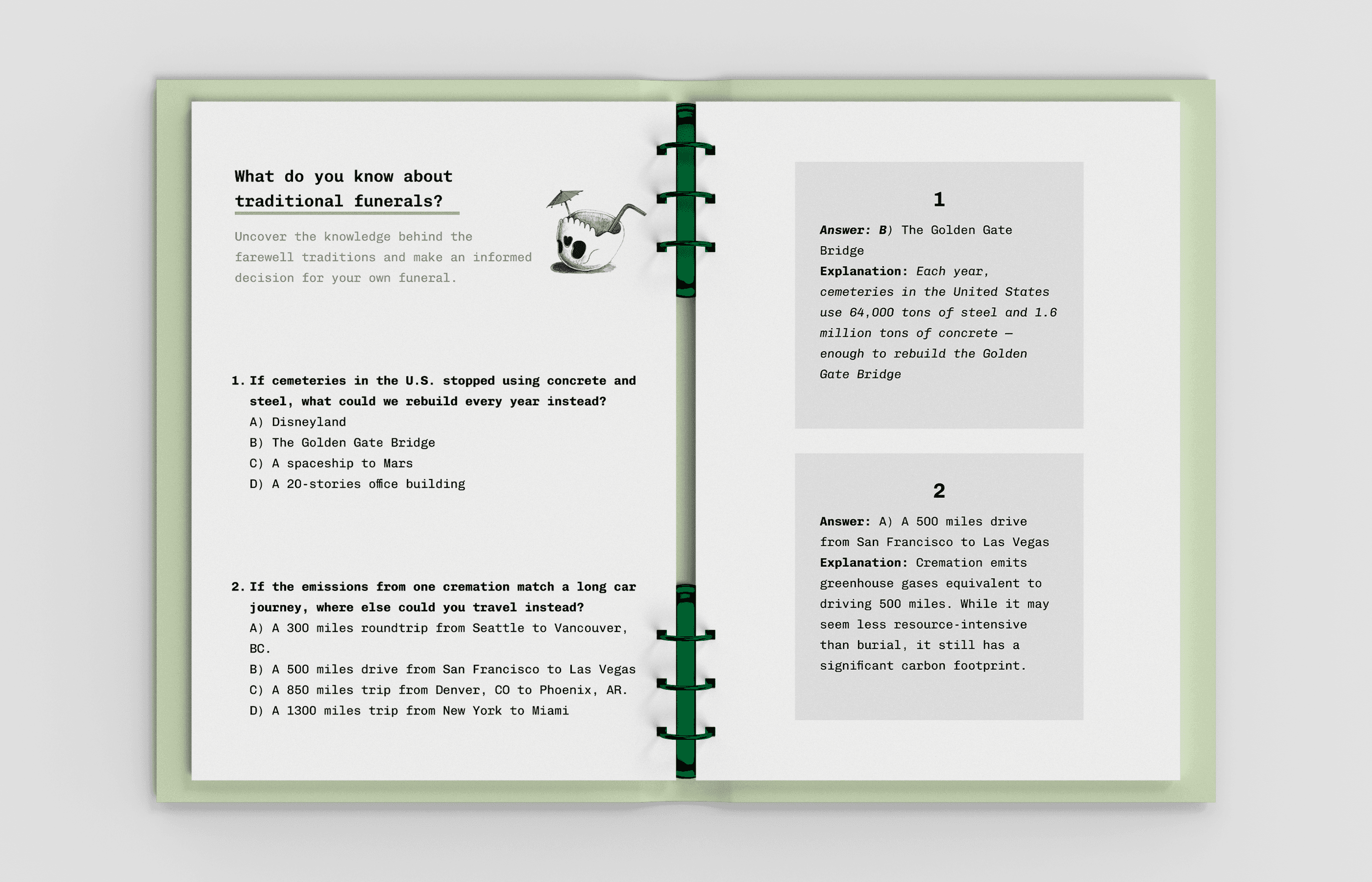
The chapter then walks through sustainable funerals key concepts like:

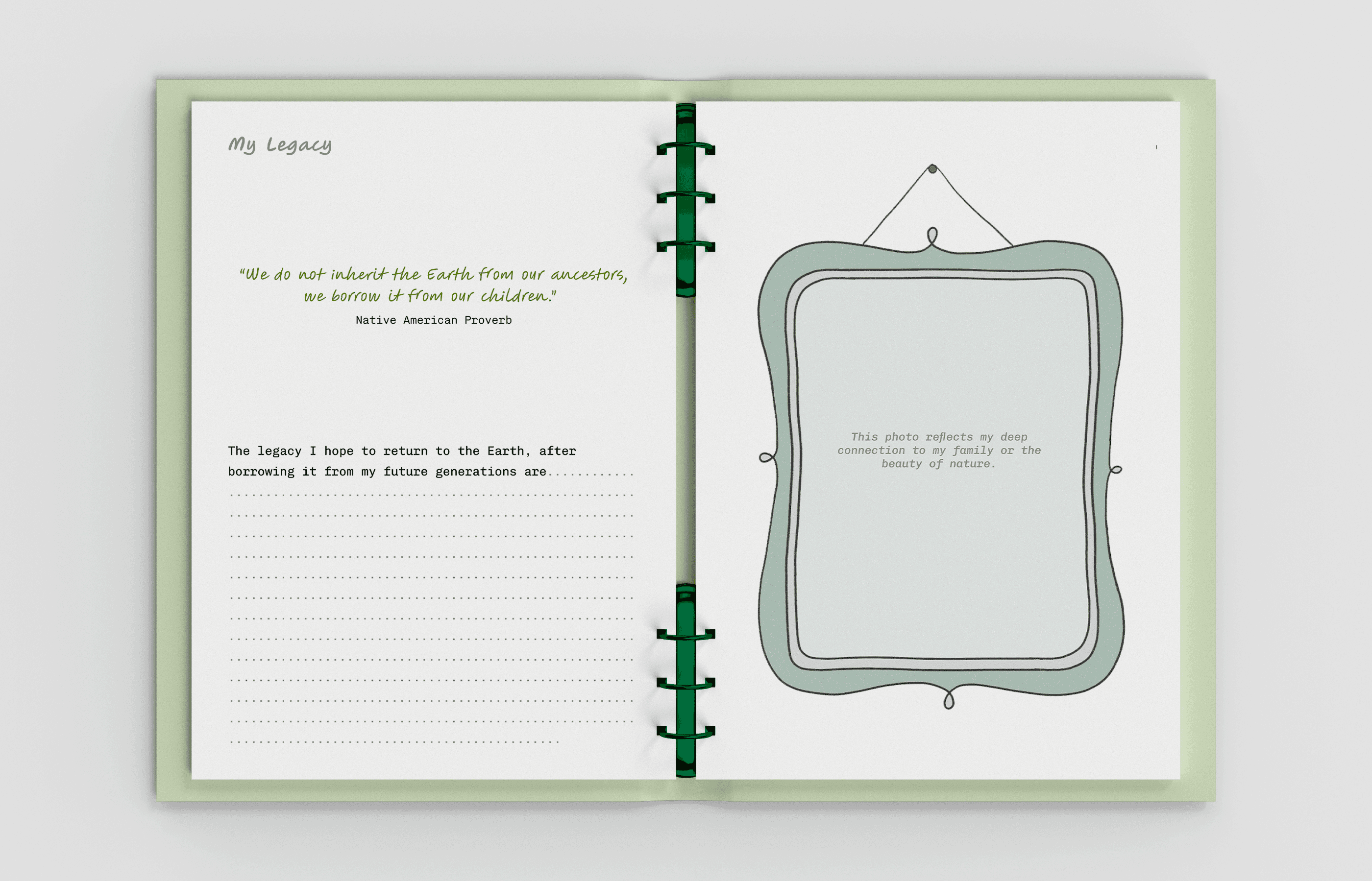
4. 🪞 Reflect
(Chapter 2 of the Guidebook)
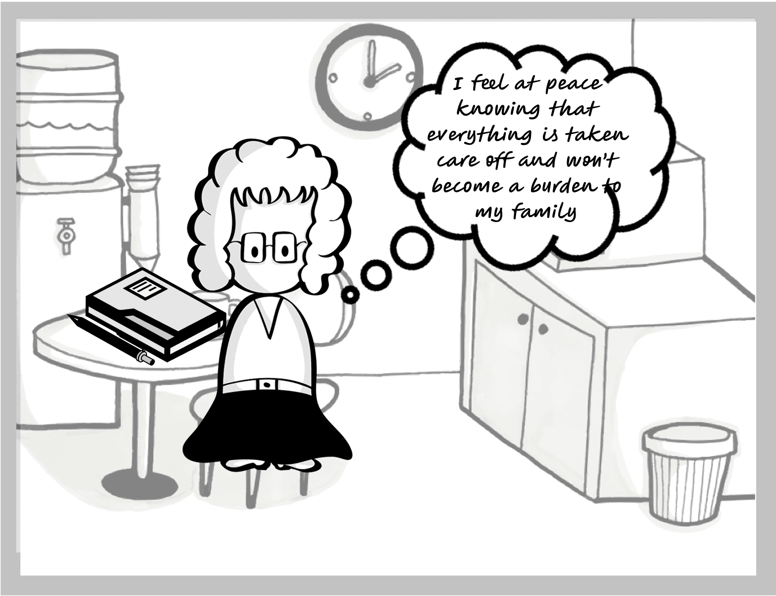
This chapter invites users to pause and think through what matters most to them.
It includes gentle journaling prompts and space for personal notes, helping users build clarity through self-awareness.
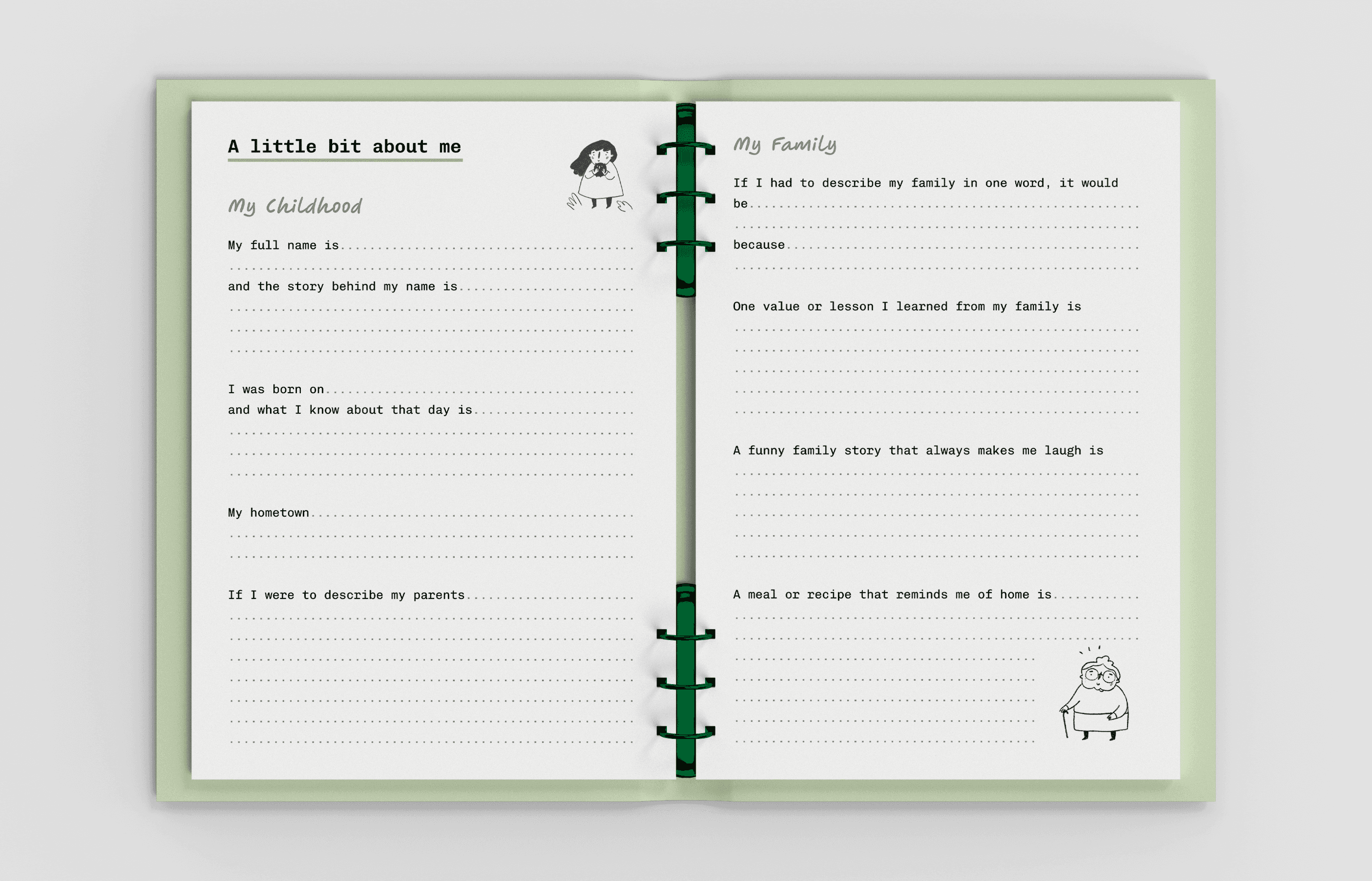
5. 📝 Decide
(Chapter 3 of the Guidebook)
Finally, users are guided through recording their wishes:
Burial method
Ceremony preferences
Messages for loved ones
Special requests or rituals


This section is practical, empowering, and designed to be shared — so families feel supported and decisions feel aligned with the person they’re honoring.
📝 My Takeaways
Meet the team: Adeline + Kim
We found ourselves navigating tender ground
Designing for something as personal as end-of-life planning wasn’t easy, it asked us to be more patient, and more thoughtful. We realized our role wasn’t to give answers, but to gently guide people through an emotional journey.
We broke out of the screen
Instead of defaulting to a digital app, we explored tangible tools, a card deck and a guidebook. These formats helped families ease into hard conversations, offering small, interactive moments or slower reflections that could unfold over time.
We learned to trust each other
With the pace moving fast, we had no choice but to communicate clearly, make quick decisions, and support one another. The pressure actually brought out the best in our collaboration.
We came out changed
By the end, we weren’t just better at design. We were better at listening, holding space, and thinking about how products can meet people where they are, especially in life’s most vulnerable moments.